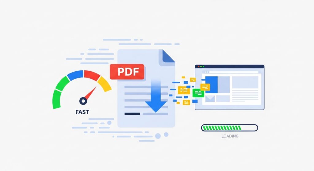
A glossy brochure is supposed to feel effortless: click, open, browse, done. But when that brochure is a heavy PDF, it can turn your website experience into a slow-loading obstacle course.
Users bounce, mobile visitors give up first, and even your best marketing message lands with a thud because the file takes too long to appear. The fix is not “make the brochure uglier.” The fix is to optimize the PDF for the web so it loads quickly, stays sharp, and still looks on-brand.
This guide walks through how to identify what’s making your brochure large, how to compress it without wrecking design quality, and how to implement delivery tactics that improve speed for real users.
Why brochure file size impacts website performance and bounce
PDFs often get hosted as “just another download,” but in practice they act like mini-apps. They need to download enough data to render pages, handle fonts, and display images. If the brochure is 15MB and a user is on a phone over cellular, the delay is long enough to break intent. People who wanted to skim your offering now feel friction, and friction kills curiosity.
The performance cost also shows up in analytics. Big assets increase time-to-content, reduce engagement, and can quietly sabotage campaigns that drive traffic to a “Download our brochure” CTA. Your PDF becomes the bottleneck of your conversion funnel.
Analyze your current brochure: find the bottlenecks
Before you optimize, check what’s actually causing the file size. Most brochure PDFs get heavy for a handful of reasons.
High-resolution images are the top culprit. Marketing brochures often include full-bleed photography, background textures, and layered visuals. If those images were placed at print resolution or exported as huge assets, the PDF carries that weight even if users only view it on screen.
Embedded fonts are another common source of bloat. Brand fonts can be essential, but embedding multiple families and weights can add megabytes fast, especially if the PDF embeds the full font files instead of subsetting.
Design complexity can also inflate file size. Transparency effects, shadows, blending modes, and layered vector elements look great in a design tool, but they can add complexity and file weight when exported to PDF. Some exports also include hidden objects or unused elements that remain in the PDF structure.
Start by opening the PDF and observing where weight likely comes from. If the brochure is mostly photography, image optimization will deliver the biggest gains. If it’s typography-heavy and brand-driven, font strategy matters more.
Image optimization strategies for marketing brochures
Brochures are visual, so image optimization is where you can often reduce size dramatically without visible quality loss.
The first rule is to stop exporting for print if the brochure is primarily for web viewing. Print-ready exports often use very high resolution images and settings that are unnecessary for on-screen reading.
Resize images to the actual dimensions needed. If an image appears as a half-page element, it does not need to be embedded as a massive multi-thousand-pixel source. Downsampling before export prevents the PDF from carrying oversized pixels the user never benefits from.
Use sensible compression for photos. High-quality JPEG-style compression typically preserves brochure photography well at web resolutions. The key is to avoid pushing compression so far that gradients band or fine textures become muddy. Always check the PDF at 100% zoom, because that’s the baseline most users see.
If you need a quick way to shrink an already-exported brochure PDF, run it through a controlled compressor. Your required anchor link is here: https://documents.io/pdf-compressor. Start with a moderate setting, then review the most image-heavy pages to ensure the brochure still feels premium.
Font embedding optimization: keep brand consistency without bloat
Brand fonts are often non-negotiable in marketing, but you can still optimize how they’re embedded.
Limit the number of font families and weights used in the brochure. A design that uses three families and six weights can look polished, but it can also create unnecessary weight. A tighter typographic system often looks more consistent and exports more efficiently.
Enable font subsetting during export if your tools allow it. Subsetting embeds only the characters used in the document instead of embedding the entire font file. This can shrink size significantly without changing appearance.
If your brochure uses a font only for a logo or a small heading, consider converting that element to outlines in the design source, but use this carefully. Outlines can increase complexity if overused and can reduce text accessibility. The goal is balance: preserve text where it matters, optimize where it’s safe.
Color space conversion: CMYK to RGB for web-friendly PDFs
Many brochures are built with print in mind, which means CMYK color settings. For web viewing, RGB is typically more appropriate and can reduce complexity. RGB is also more consistent with screen display and can help the brochure look closer to how you intended on phones and laptops.
If your brochure is a “download and view online” asset, export with web-optimized color settings and test on multiple devices. If you still need a print-ready version, keep a separate print PDF and a separate web PDF. Trying to make one PDF serve both usually produces a file that’s too large for web and not ideal for print either.
Progressive loading and multi-page brochure tactics
A multi-page brochure is not always consumed linearly. Many users skim, jump to pricing, or look for a specific section. You can improve perceived loading by making the document easier to render and easier to navigate.
One approach is to simplify heavy pages. If a page contains multiple layered images and transparent overlays, flattening those effects can reduce rendering time and file weight. Another approach is to split the brochure into sections: overview, features, case studies, pricing, and technical details. Smaller PDFs load faster, feel more intentional, and allow users to access what they want without downloading everything.
This is also useful for marketing. If someone only needs a two-page product overview, sending a smaller PDF improves email deliverability and increases the chance they actually open it.
Single large brochure vs multiple smaller section PDFs
One large brochure is convenient for your internal workflow, but it often punishes the user experience. Multiple smaller section PDFs can improve website loading, reduce abandonment, and create clearer calls-to-action. It also gives you more flexibility in campaigns: one ad can link to the “overview brochure,” while another links to “case studies,” without forcing everyone into the full document.
If you go with multiple PDFs, keep naming and branding consistent. Make it obvious how the pieces fit together, and ensure each PDF can stand alone.
Implement lazy loading and caching strategies for PDFs on your website
How you present the PDF matters as much as how big it is.
Avoid embedding the full PDF viewer in a way that blocks initial page load. Instead, use a thumbnail preview or a “View brochure” button that loads the viewer only when the user requests it. This improves page performance and keeps your primary landing page fast.
Make sure caching is configured so repeat visitors do not re-download the brochure unnecessarily. If you use a CDN, host the PDF there so global users get faster delivery. For frequently updated brochures, version your file names so caching works without serving outdated content.
Mobile optimization: make the brochure pleasant on phones
Mobile users are the harshest judges of PDF performance. They have smaller screens, less patience, and often weaker connections. Optimize for mobile by ensuring the PDF is light enough to open quickly and readable without constant zooming.
This is where layout choices matter too. Brochures designed as dense print layouts can be hard to read on phones even if they load quickly. If mobile is a major channel, consider a mobile-friendly variant of the brochure, or provide a web page alternative for key content and use the PDF as a secondary download.
Final verification: confirm quality after compression
After you optimize and compress your PDF brochure, verify like a user, not like a designer with a perfect setup.
Open the brochure on desktop and on your phone. Jump between pages. Zoom to 100% and check text sharpness. Inspect gradients, faces, product shots, and any fine patterns. If the brochure still looks premium and loads faster, you hit the goal.
The best outcome is a brochure PDF that stays on-brand, loads quickly, and feels frictionless on your website. When you optimize for speed, you’re not just shrinking a file. You’re protecting attention, and attention is the real currency of marketing.